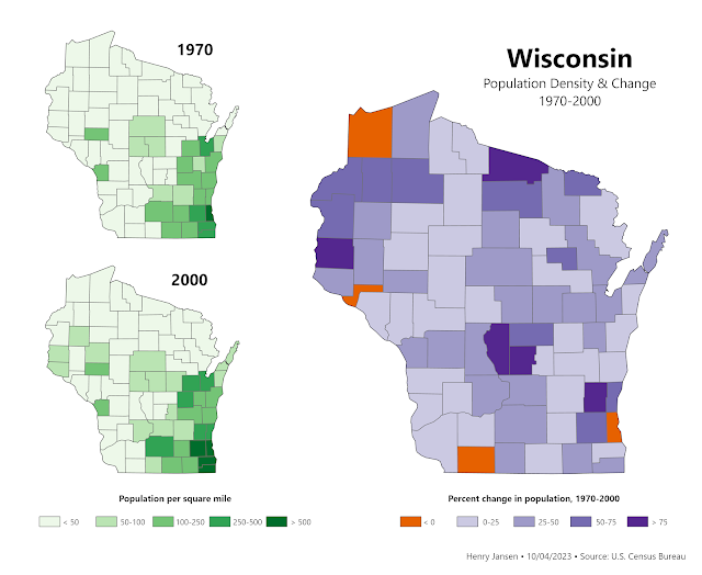
This choropleth map uses different shades of green to show Wisconsin's population density by county in 1970 and 2000, and shown in purple is the percent increase in population that each county experienced in those 30 years. Counties with negative growth are symbolized in orange.
